Redesign to became in Visit Melbourne's App
Intro
I led the prototype of the most visited website in Melbourne, Australia. I utilized strategy frameworks, discovered core actions, pitched the ideas, and shipped a polished design.
Overview
Visit Melbourne is a website where you can find out everything about the city, being more specific is a site created for tourist, foreign and everybody that want to plan an activity. That website was builded for the government of Australia.
It all started when I applied for a freelance job. I was assigned the project of improving the visual design and creating an approach of redesign, which would eventually become in an App. It was a unique challenge.
Why we did it?
CVR of website show steel data (impressions and clics) Together with the team in charge of the site they did field work to know why the page was not being used by people, they found that:
- The website is confuse
- Problems in business logic and client errors
- Redundancy in some sessions or options within main functions
- Some places didn’t complete information and lost the storytelling.
Read canvas
Business problems
- Usability problems
- Session to explore saturated and irrelevant information
- Some path result confusing to users
- The filter option can be better because the user needs to go to the menu first to explore the region but in the App, this doesn’t work properly, for the developer and user to filter the information from begging it will able to generate a change in the content showed instead of open a lot of pages or screen.
Archetypes
Everyone which want to know about activities and places for visit Melbourne.
Hypnotises
We consider that the user will feel more confidence with a interface more clear and simple to use, allowing a navigation more direct to the content found by them also simplify paths in the user experience minimize clics and time the user after that improving the content of the core options will allow the user discover new places or relevant content.
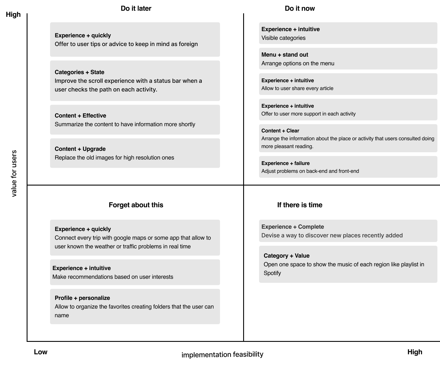
Solutions
The filter option can be better because the user needs to go to the menu first to explore the region, but in the App, this doesn’t work for the developer and user to filter the information from beginning. It will able to generate a change in the content shown instead of open a lot of pages or screens.
What is important to known?
-
A risk that exists in web-users is that can to find download an App like hard work.
-
The experience change from large screen to phones screen, this can be a problem for user that enjoy the dive experience in laptop.
Results and benefits for users
- less time finding their searches
- explore interest content
- interface clear, functional and assertive.
Results and benefits for business
- Metrics in the gather of data will increase
- Users can share information more easily with others
- Implement improvements faster without depending on the performance or optimization of a third party.
What we need to do that not depend invest effort or resources and learning more the next time?
- Usability tests
- Experience Map
- A/B Testing
- Interviews
- Heat maps
Some resources used
Challenges of the project
-
Freedom creative: It’s well known that freedom creative is a hard work an involves a lot of effort. In my first meeting the client was clearly. They wanted a fresh design, modern and clear and I was allowed debug the current user flow making it more user friendly and less confusing.
-
Fuzzy problem: The current website had some issues in the user experience, principally the amount of information that show to users, simplify a few actions or task was harder of thinking because will be too much for the App.
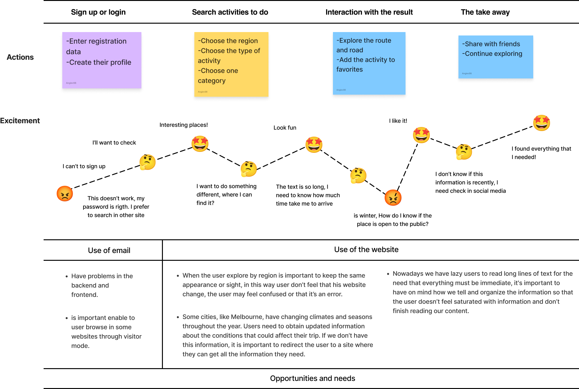
Firts-time Using Journey maps
Create Journey maps was a good idea as to say Steve Jobs “Design isn’t just what it looks like and feels like — design is how it works”. I needed to know the point in the found the previous site as a prototype to make data-driven decisions and be able to develop the new design that addresses the problems with the old site and enhances the user experience, sorting out relevant and irrelevant elements. I had an ample view now.
- Quick and dirty research methods. the brainstorm started base on it. I try with a lot of examples but finally the client done his choice.
- Creating a task: delightful than ever.
- Task details page: more effective call-to-actions.
Creating new core options
- Delete multiple menu
Something happened when the user pick in a few options, appear another options that doesn’t exist in the principal menu so if the user not clicked before never to know about this hide options.
- Customize design
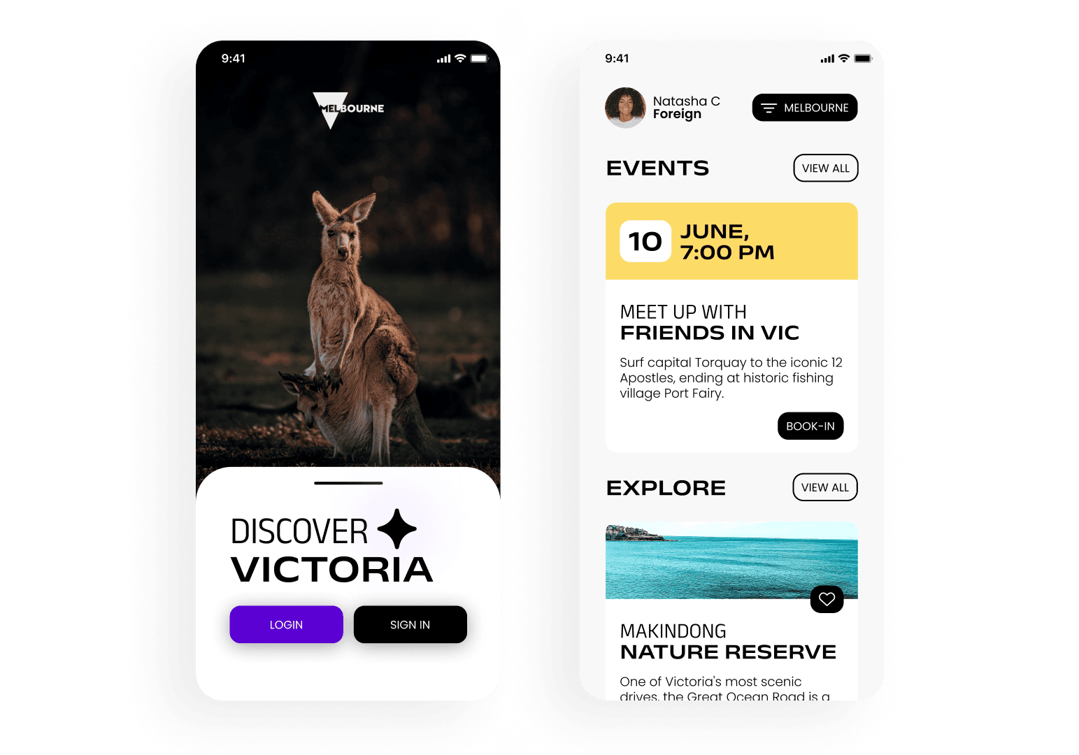
In the old core option, you could figure out the option “explore by region” this allowed a dive in a customize experience but it’s was taking them too much time to find it because on the way you needed to open a lot of journeys and back to the principal point would take a lot of clics, this is too much for users so for this reason I customized the option implementing the button “filter” adapting each option of the menu to the region, finally users can see the content at from your own search about what them want to.
- other changes: every detail matters
Others changes were some descriptions and call-to-actions that allowing a better experience to users doing more comfortable to explore.
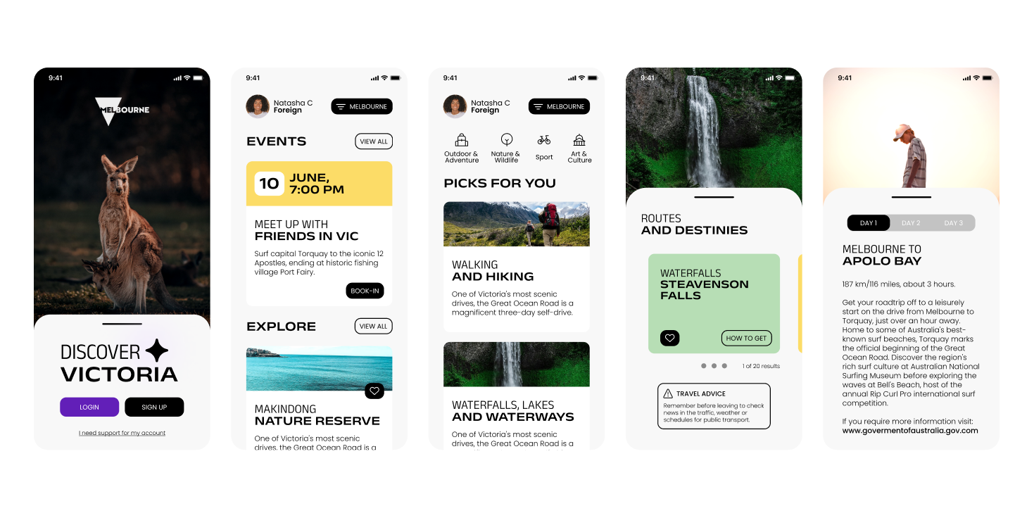
Some screens
What’s next
I will validate all the design decisions based on the performance of key metrics such as usability test and interviews.
The biggest lesson I learned in this internship is the tradeoff between quality and visual, because something our customers prefer cute design that great experiences. However, designers have to learn to balance between time, interface design and quality constraints.