Three design calls that moved the numbers.
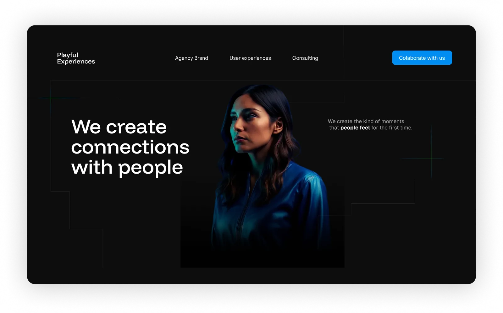
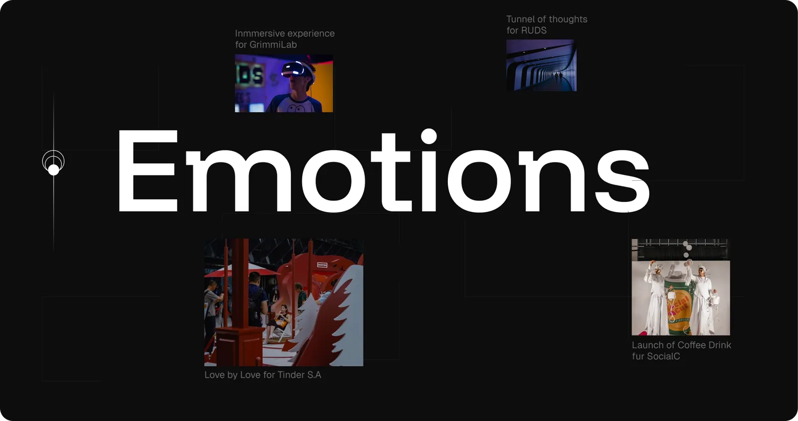
Narrative-first homepage
The first section explains what the agency does in one sentence. The second goes deeper into the how. The third is an interactive grid that groups campaigns under the brand's core concepts: Expectation, Activation, Experience. No mystery, no paragraphs. You scan, you understand, you scroll.
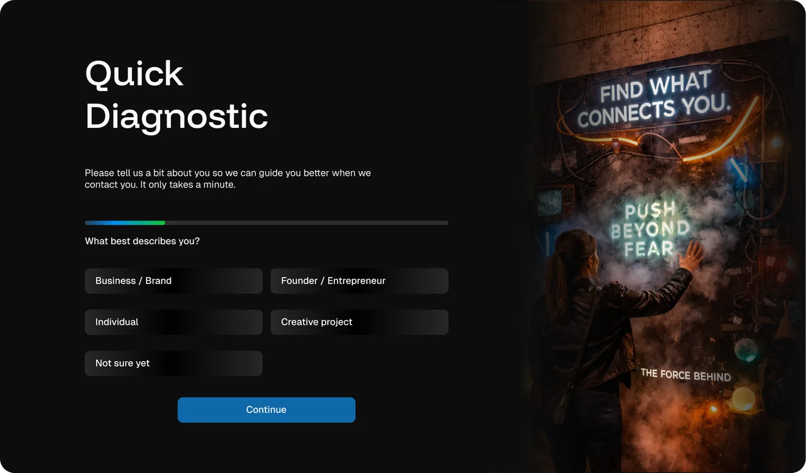
Quick diagnostic form
Instead of a generic contact form, users answer a short sequence of questions before submitting: Are you a business, an individual, or a creative project? What's your stage? What do you want to activate?
Yes, it adds friction. But it replaces hours of back-and-forth emails with a single well-scoped inbound. The client gets context. The user gets a more useful response. Both sides win.
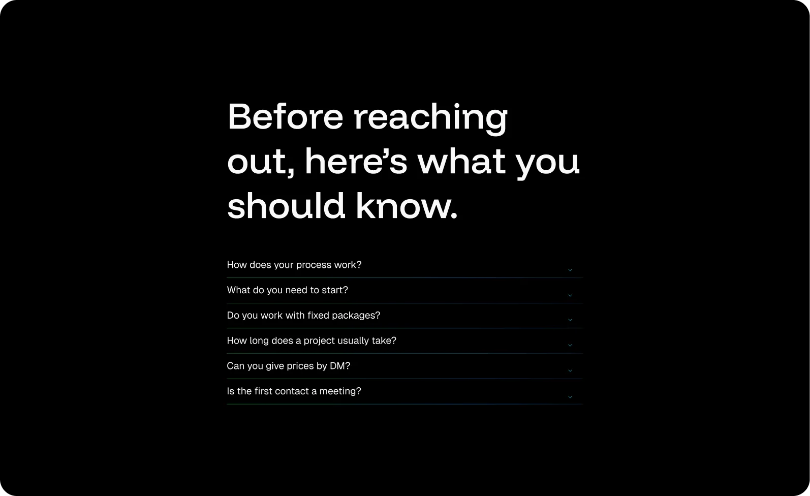
Self-service FAQ as architecture
I moved the six most-asked DM questions directly into the information architecture — with answers that are honest, not sales copy. The goal was to make the FAQ feel like the team's real voice, because the users who still reached out after reading it were the ones worth talking to.